Cool but Cooked, My insights on iOS 26 Liquid Glass design, what're the problems
Cool for a quick look but unreliable inconsistent UX
Wednesday, November 19, 2025 - by Soumya Roy
Apple introduced Liquid Glass design with iOS 26 that was recently released in September 2025. The latest iPhone 17 lineup just got launched with the stable iOS 26 that has the Liquid Glass user interface. This Liquid Glass design aesthetics look very fancy from a quick look but it's a totally different scenario if you're daily driving the Liquid Glass user experience. I have many thoughts about this new Liquid Glass design from a UI & UX designer's point of view. So, this article is about the problems you are gonna face while using iOS 26 UI, things you may like or dislike about Liquid Glass, how the user experience will be affected by this glass-like design and how to improve the Liquid Glass design for future iOS.
The Liquid Glass design feels like it's having identity crisis. Dynamically changing colors of texts and icons create a processing overhead that takes a toll on the battery. Also, this glass design on iOS 26 has limited colors and personalization, totally opposite of Google's Material 3 Expressive design. Overall, I think the Liquid Glass design has potential but right now it's messy, unreliable and inconsistent. It requires a lot of optimization and refinement to make it long term. I wrote about some solutions at the end.
When we think about glass, it's always like fancy and fragile both at the same time. The Liquid Glass user interface on iOS 26 'closely resembles how real glass-materials behave. It simulates the dynamic, optical properties of a real-world fluid material. This new proper glass-like design adds a much greater sense of depth, fluidity, and dynamic realism than other frosted-glass UI-elements. The previous frosted-glass design was somewhat cool too but the Liquid Glass design is even cooler as it's kinda way more fancy and fresh.
THESE G-ADS ARE SAFE AND INFORMATIVE - PLEASE
Disable Ad BlockeR
So, imagine if the browser has a floating address-bar and it's like a thick curved glass with pill shape, then scrolling the page will make the glass address-bar dynamically adapt to the content underneath the address-bar. This reflection, refraction, distortion, fluidity and other properties of glass along with adaptation make the floating liquid glass elements look so cool and fancy. It is for sure 100% an attention grabber. This creative glass-like design plus iOS 26 animations can make the user interface very active, reactive and alive, which make the whole thing really appealing.
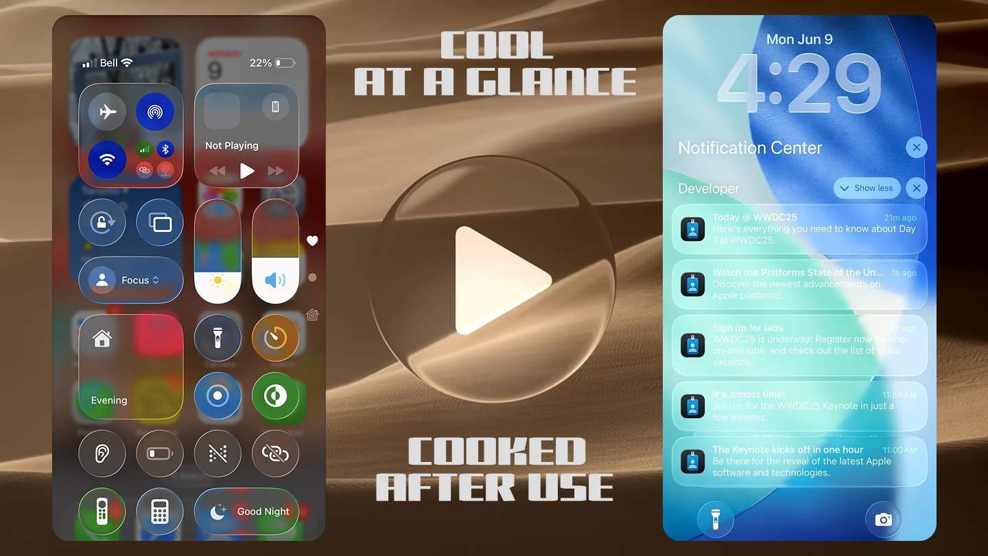
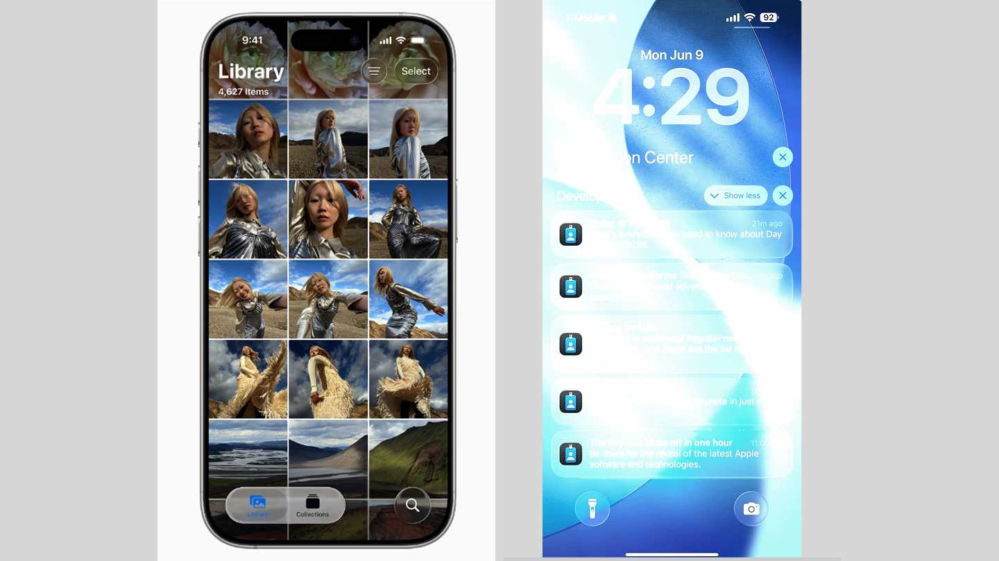
The glass elements are like, they are very aware of their surroundings. So there are some floating elements and non-floating elements in iOS 26 user interface across the board. The floating address-bar in the Safari browser-app is a very good example. Lock-screen floating elements, when you pull down the notifications and Apple Photos-app are some places among many others where you can see floating liquid-glass elements. So, as the glass-elements are continuously adjusting and adapting to their surroundings, they never look the same. It's like there are some identity-crisis going on here.
It is going to take you more time to adjust to this dynamic nature of Liquid Glass UI. You may not remember any buttons or icons by a particular color, which is not easy to adapt - this affects user experience. When the content below is dark, like a dark image - the floating buttons will have white icons and texts. But when the image below is a bright one, the floating glass-like elements will have black icons and texts to make them readable. However, huge problem arises when the content below is somewhere between dark and light. The texts and icons inside Liquid Glass elements become hardly visible. This scenario is bound to happen more than 50% of the time - a lot right ..?
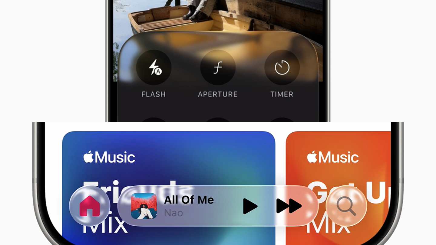
As the glass-elements kinda mimics actual glass-like effects, there are a lot of reflection, refraction and distortion going on from content around the elements. In many situations for everyday-use, you may think that a lot of things going on with those liquid glass elements. The floating glass-elements show reflection of content in a very distorting way. This is very dynamic, happens in real-time while you interact with the screen.
These ads are safe, informative and interesting. Turn off ad-blocker for this website. Ad revenue helps to keep the site alive.
Please Disable Ad BlockeR
You might be able to get used to it, but the whole liquid glass experience is pretty distracting and overwhelming. Think about this, when you are scrolling and interacting within an app, you wanna focus on the content that you're interested in. Liquid Glass elements that change color of texts, icons and background in a regular manner affects the user experience in a clear negative way. A good user experience doesn't let things get in your way while you're trying to focus.
Please take a look at this video to understand how real-time processing is going on to continuously monitor the content present on the viewport or screen. So in simple terms, to implement Liquid Glass there were many challenges, how to cope with the dynamic adaptation was a very big challenge. Just like I mentioned before, white background will make the liquid glass elements look white, like a distorted reflected blurry thick glass with depth. Because of this, other elements inside can't have white texts and icons - they need to be dark.
THESE G-ADS ARE SAFE AND INFORMATIVE - PLEASE
Disable Ad BlockeR
However, a scrollable content area that has all sorts of colors like white, black, blue, red, gray, semi-dark and a whole lot more will make it difficult for the texts and icons inside glass-elements to standout and be readable. One way to fix this is, monitor certain areas within the viewport, if content below liquid glass element is white make the texts and icons inside the glass UI be dark, and if content is dark dynamically change the texts and icons to white. But this requires continuous real-time monitoring that creates extra CPU-processing overhead. If not optimized or handled correctly, this additional processing can take a toll on the battery.

Check out those articles from above, you can click on those linked images to read the articles. A while ago I published a review of the Samsung Galaxy A14 5G smartphone, check that out if you are into budget phones. In case you are interested in portable speakers, I compared 3 Boombox type speakers from 3 different brands such as Soundcore, Tribit and JBL. So don't forget to also check out that detailed comparison article about the JBL Boombox 3 vs Tribit Stormbox Blast vs Soundcore Boom 2 Plus.
The visibility issues are a huge problem in iOS 26 Liquid Glass design. You can't control what wallpaper people are gonna put on for their home and lock screen. You are not gonna have a problem with a particularly dark or light wallpaper, but with wallpapers that have areas with semi-dark or semi-white colors, the notifications will look very messy with low contrast and be barely visible. I have seem many places all-over the system and app's UI where the Liquid Glass design becomes like a frosted glass design, which is very inconsistent.
I think this Liquid Glass aesthetic needs a lot of thoughts and refinement to make it a long-term stable UI design that also gonna provide a good efficient user experience. Also, the glass-like design needs to be consistent all-across the board, it can't be a half-baked design that has poor user experience. Right now Liquid Glass on iOS 26 looks like a half-baked UI. Apple is trying to fix the Liquid Glass by making it kinda like frosted glass and they are doing battery optimization. But if they don't figure out a way to make Liquid Glass consistent and reliable, it may not be here for long term.
There can be many solutions to fix the Liquid Glass design, but some approach will look less glassy but more frosty. In my opinion, the Liquid Glass design is very distracting and overwhelming, so an element can have a somewhat thick Liquid Glass border. This will have the glass-effect on the thick border only. So all the visibility problems along with other problems will be gone. However, it's a proper glass-like look but just on the border, so it is not that prominent like the current design. But I will like the subtle aspect of it. Another way to solve this is to use text shadow or text stroke effects on glass elements' content. But this will keep the overwhelming Liquid Glass design but solve the visibility issues.
THESE G-ADS ARE SAFE AND INFORMATIVE - PLEASE
Disable Ad BlockeR
The next fix will be to make it frosty dynamically. The processing can dynamically change the texts and icons color based on dark or light background on the viewport, but for semi dark or light scenarios make the Liquid Glass elements transform to a Frosted Glass look - solves the visibility issues. A permanent frosted glass design is totally moving away from Liquid Glass - not a good solution. As a web designer and developer, I see a lot of potential in Liquid Glass aesthetics, but it is also very hard to refine and provide a better user experience. I think Google's Material 3 Expressive on Android 16 is more like moving towards the right direction.
Also, please check out the JBL Charge 6 vs Charge 5 story for highlights.
IF you're interested in mid-sized portable speakers, check my JBL Charge 6 vs Bose SoundLink Plus article. The JBL Charge 6 did better in the head-to-head comparison.